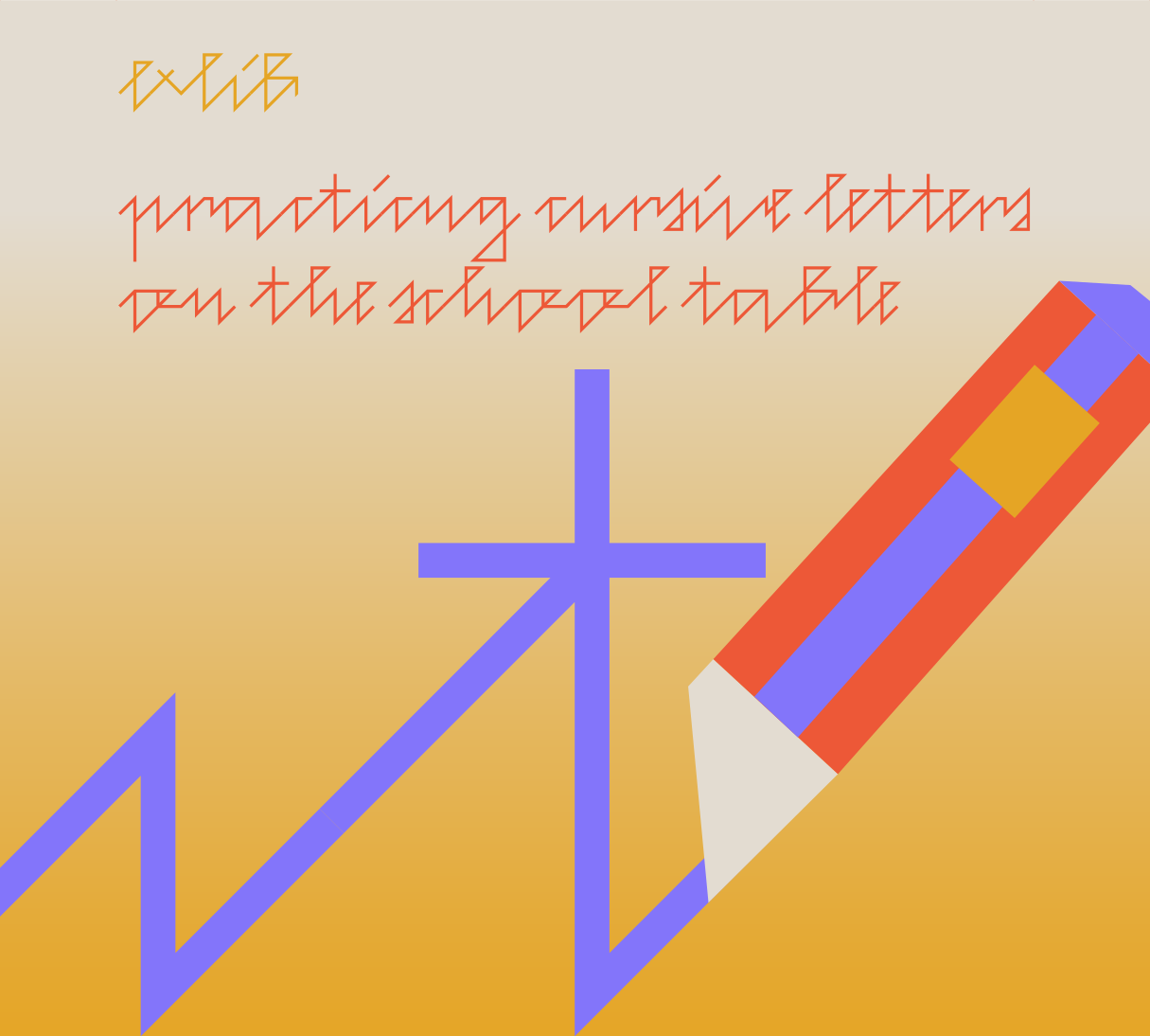
Exlib is an ideologically geometrized version of the author’s handwriting, consisting solely of lowercase letters. A strict grid, a uniform backbone, straight lines, sharp corners, and precise connections form a dynamic script typeface in four weights with a distinctly structured visual rhetoric. As a derivation of an ex-libris stamp, the letters were converted into fonts at the turn of the millennium. Since then, the typeface has been used for studio Aparat type&design branding, typographic, and publishing projects.
Designer: Domen Fras
Free!
(Non-commercial use)
Starts at 60€
(Desktop + Web + App)
The current state of the typeface

Weights
Numbers
Some special characters
Script connections
Large language support
Exlib Family
200 px
connection
Exlib Thin
200 px
scratching
Exlib Bold
200 px
Wide pen


